Digital Accessibility Is a Bigger Education Issue Than We Think. Here’s What We Can Do About It.
About a month ago, a colleague forwarded me a newsletter from the school she works with. It was a normal-looking school newsletter: a three-page PDF with information about upcoming events, decorated with colorful clip art of flowers. However, the subject line said: “How do I get them to stop doing this?” I knew exactly what she meant.
The newsletter, while pretty, had the gritty look of a document that’s been printed out and scanned back into the computer. I tried to click on the text to see if I could highlight or select one of the words, but I couldn’t. The newsletter was just one big image with no recognizable text or other elements.
As a school communications professional trained in digital accessibility, I’ve probably seen hundreds of newsletters like the one forwarded to me — and that’s a problem. A document like that can be completely unreadable for a parent or guardian with a disability. I know this because the schools I work with rely on me to ensure their communications are accessible.
Unfortunately, it’s not just the schools I work with that are grappling with this issue. Recently, there has been a high volume of complaints about digital accessibility in K-12 schools filed with the Office for Civil Rights.
The Centers for Disease Control and Prevention estimate that 1 in 4 Americans have a disability; this includes visual, hearing, ambulatory, cognitive, self-care and independent living disabilities. The impact these conditions have on people’s ability to perceive, operate and understand the communications they receive are varied, and disabilities can impact people of any age, race or income level.
I’ve consulted with dozens of school leaders and talked to hundreds of school communications professionals from across the country. Virtually all of them agree that they want shared information to be accessible to everyone in their school community, and frankly, who wouldn’t? However, many aren’t even sure what digital accessibility means; others know enough to know they should be doing more but aren’t sure where to start. They look at the apps, websites and documents their district is responsible for and feel overwhelmed.
It’s hard to know how to tackle it all, but we cannot let the magnitude of the task deter us from taking the first steps.
The Impact of Inaccessibility
I spoke to one blind parent about how well her child’s school communicates with her. She brought up the fact that missing out on even “low-stakes” information can have a profound impact on a child and their family.
“If you can’t figure out how to email me the information about the spring concert, my son becomes the only kid who doesn’t know about it,” the parent explained. “So when I don’t show up because I don’t know about it, how does my child feel about me? It’s all because someone couldn’t bother to email me the information so I could read it.”
The woman I spoke with may be the only blind parent in her school district but the district’s obligation to make information accessible is still enshrined in law. Like curb cuts or ramps, digital accessibility is still required, no matter how many people are impacted.
But unlike a curb cut, which you only have to build once, digital accessibility is an ongoing, collective effort. It relies on educational technology vendors, school administrators, teachers, clerical staff and many more partners in education. It isn’t something you do once and forget about.
Consider a school newsletter like the one that was forwarded to me. A school secretary probably put together the three-page PDF, but it contained an order form from a yearbook company and a flier from the parent-teacher association. It was sent out by a school communications professional using a mass notification system provided by a vendor. Digital accessibility requires each of these partners to keep accessibility in mind. That’s just one example of the numerous communications that travel from school to home, and there will probably be another one every month.
When I look at a teacher’s colorful Bitmoji classroom, I’m not charmed by the cute images or the hidden “Easter eggs” that invite students to click around in hopes of finding a link. Instead, I’m wondering how much frustration those “hidden” features could cause for someone with cognitive or visual disabilities.
When I read a letter from the superintendent that’s on letterhead and uploaded to the district website as a PDF, I’m not impressed by how “official” the document looks. Instead, I’m wondering if anyone is going to be able to read it on their phone — let alone their screen-reader software.
When I watch a funny video of a principal announcing a snow day or asking students not to skip school after a Taylor Swift concert, I’m not laughing at whatever joke or pun or goofy thing they’re doing. Instead, I’m looking for the closed captions and wondering if anyone checked to see if the captions were accurate.
Accessibility isn’t optional. It isn’t something to add on later. It must be foundational to the work we do as education professionals. This requires schools to think differently and learn how to put the needs of our audiences first — often above our own convenience. It’s not a small task, but it does not have to be a complex one.
Five Steps Toward Accessible Communications
The good news is accessibility helps everyone. Literally everyone. I’m a sighted person, but I still don’t want to have to click through two different platforms and open up a PDF just to find out what my child is eating for lunch tomorrow! In my work with school districts, I’ve learned key practices that can make almost any communication more accessible, regardless of your role or the software or platform you’re using. Whether you’re a classroom teacher, an edtech professional or a district leader, taking these five steps can make a huge difference.
-
Let text be text. The WebAIM Principles of Accessible Design recommends using HTML text as the most accessible way to present information. So rather than uploading a document to share, consider putting information directly in the body of the message or post you’re sharing.
Letters to families are a great example of this. When my child first enrolled in school, the district office sent out an email to parents to let us know what kindergarten classroom our child would be in. When the email came through, I was at the grocery store, and I remember excitedly opening the email message — only to find text that read “Click here to read your child’s kindergarten letter.” From there, I had to download the attached PDF onto my phone and try to open it from there. Not exactly an optimal user experience — and that’s for a sighted user! That same PDF file can be even harder to navigate for a parent or guardian who’s disabled.
This year, I’ve been delighted to see the school send out messages with the important information I need right there in the body of the email. It makes the message so much more accessible for everyone.
-
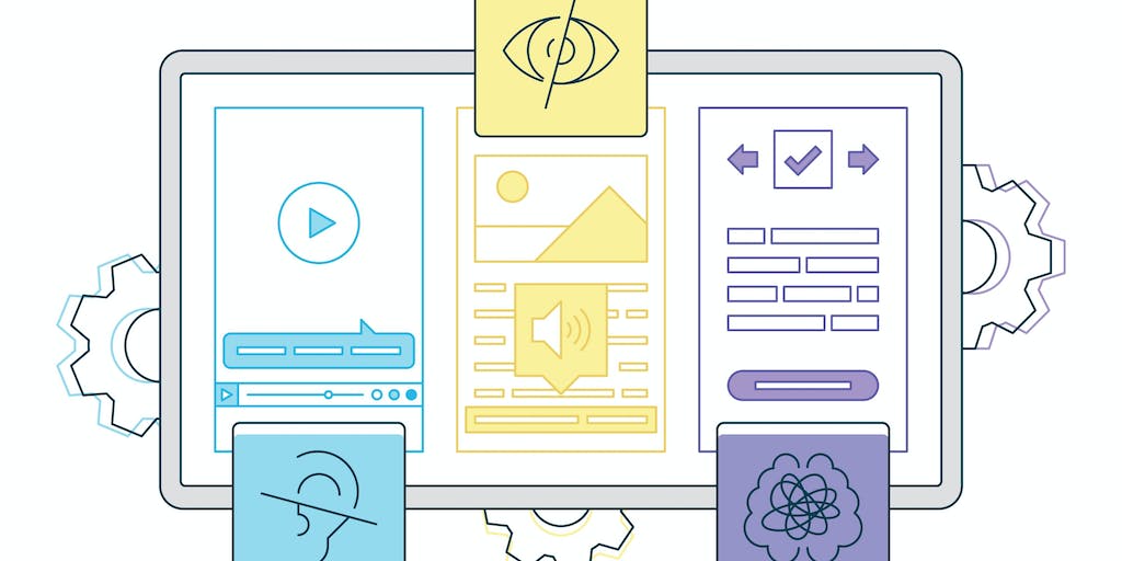
Provide alternatives. Audiences will consume information differently, and educators should account for that. The Americans with Disabilities Act (ADA) specifies that different supports are needed depending on the nature of a person’s disability. Videos should have accurate captions, and if important things are happening on screen in a video, make sure those things are written down somewhere too (like in the description of the video).
If there’s an option to include alternative text or “alt text” on an image, please use it! This will vary depending on the platform, so look it up if you’re unsure how to do it. Alt text is always important, but it’s absolutely critical if the image you’re sharing contains the text.
Last winter, I wanted to create an eye-catching graphic for a district to share on social media about their upcoming Spirit Week. The graphic had information about what the theme for each day would be, from “Merry Morning Monday” to “Color Block Thursday.” I made sure to list all that information in alt text and in the post itself, just to be sure that anyone who wanted the info could get it easily — especially if they are using a screen reader.
-
Keep it simple. Don’t use a chart or table if a list will do, and don’t use a table just because you want your text to break across two columns. Use the formatting tools in whatever program you’re using to do what they’re designed to do. Break up long stretches of text with headings. Limit visual clutter. Before adding an image or design element, ask yourself, “Does this enhance or distract from what I’m trying to say?”
Choose fonts that are easy to read and avoid making them too small or too light in color. Be especially careful with color combinations of text and background, which may limit readability due to low contrast. I usually check my color combinations with the WebAIM Contrast Checker to be sure they pass.
-
Be clear, direct and helpful. If you’re linking to a web page or an attached file, use unique, descriptive language to point to your link, like “Read the Code of Conduct” instead of just “click here.” One school website I visited had a whole web page of Board of Education meeting minutes that were all just labeled “Board minutes” with link after link that all read the exact same thing. This can be confusing to almost any user — even more so to someone with a visual or cognitive disability.
Identify your messages in a distinctive, informative way. During a communications audit, I reviewed several email messages from one school district that were sent to parents. Many of them had very similar or even identical subject lines such as “An important message from the principal.” Instead of this generic address, lead with the most important information and always include a name, phone number and email address for people to reach out if they need more information.
- Choose supportive partners. Most schools and districts work with third-party partners for everything from school lunch menus to sports sign-ups. Choosing third-party partners who value accessibility makes a huge difference to the experience your audiences will have. When choosing supportive education partners, ask about accessibility; it’s important for edtech companies to hear that their customers prioritize this issue. I met with one school district a few weeks ago to talk about redesigning their website and was delighted when they asked me about how I could help them make their website more accessible. Your vendors should be excited about this too!
These five tips aren’t the be-all and end-all of accessibility — but the maxim to “Do what you can, with what you’ve got, where you are” is very relevant here. Accessibility is a journey, not a destination, and the most important thing of all is to begin.
Dig Deeper With Our Longreads
Newsletter Sign up to get our best longform features, investigations, and thought-provoking essays, in your inbox every Sunday.
The MEN was founded by John Huber in the fall of 2020. It was founded to provide a platform for expert opinion and commentary on current issues that directly or indirectly affect education. All opinions are valued and accepted providing they are expressed in a professional manner. The Maryland Education Network consists of Blogs, Videos, and other interaction among the K-12 community.


